CSS Gap Space with Flexbox
CSS Flexbox and CSS Grid are fantastic tools available for managing layout on the Web. Flexbox handles single-dimensional layouts very well, while CSS Grid handles two-dimensional layouts with columns and rows. Often we want to add space between the items within our layout. This post will show how to add space between flex items using the CSS gap property and the necessary workarounds for browser support.
Inline Flex
To demonstrate CSS Gap, we will use Flexbox. CSS Gap works in CSS Grid, but there are many cases where we have inline lists that need space without a defined grid.
<div class="flex-gap">
  <div>1</div>
  <div>2</div>
  <div>3</div>
  <div>4</div>
  <div>5</div>
  <div>6</div>
</div>
.flex-gap {
display: inline-flex;
flex-wrap: wrap;
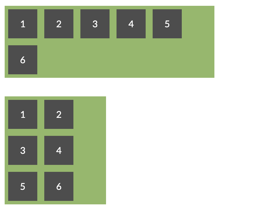
}We use inline-flex to have flex items but display our parent element as an inline element instead of a block element. The flex-wrap: wrap property will allow our items to wrap as the parent container shrinks or is constrained.
If we want to add space between each item, we could use margin on each item.
.flex-gap {
  display: inline-flex;
  flex-wrap: wrap;
}
.flex-gap > div {
margin: 6px;
}
Margins works but is not the same behavior as CSS Gap space. Notice the extra space surrounding the boxes. With gap spacing, we only want space applied between the items. Using CSS Gap, we can achieve this.
.flex-gap {
  display: inline-flex;
  flex-wrap: wrap;
  gap: 12px;
}
CSS Gap is a feature of the CSS Grid spec and Flexbox. Currently Firefox is the only major browser that supports Update: As of April 25, 2021, CSS Gap for Flexbox is supported in all major browsers! 🎉gap on flex items.
To support older browsers that don't support Flex Gap in Flexbox we can use a margin hack to create a close workaround.
<div class="emulated-flex-gap">
  <div>1</div>
  <div>2</div>
  <div>3</div>
  <div>4</div>
  <div>5</div>
  <div>6</div>
</div>
.emulated-flex-gap > * {
margin: 12px 0 0 12px;
}
.emulated-flex-gap {
display: inline-flex;
flex-wrap: wrap;
margin: -12px 0 0 -12px;
width: calc(100% + 12px);
}We can set margin space on the top and left of each item. On the flex parent element, we use negative margins to counter the excess margin on the outer child elements. This technique will get a similar effect to CSS gap space.
We can clean up the CSS a bit by using CSS Custom Properties, so it is easier to change the margin spacing.
.emulated-flex-gap {
  --gap: 12px;
  display: inline-flex;
  flex-wrap: wrap;
  margin: calc(-1 * var(--gap)) 0 0 calc(-1 * var(--gap));
  width: calc(100% + var(--gap));
}

.emulated-flex-gap > * {
  margin: var(--gap) 0 0 var(--gap);
}
With this workaround, we can get something close to CSS Gap space in older browsers. With CSS Gap spacing, we can remove much of the white space complexities in CSS when using margins. Check out the full working demo below!


'%20points='107.644,470.877%2074.633,100.62%20437.367,100.62%20404.321,470.819%20255.778,512'/%3e%3cpolygon%20fill='hsl(18,%2086%25,%2055%25)'%20points='256,480.523%20376.03,447.246%20404.27,130.894%20256,130.894'/%3e%3cg%3e%3cpolygon%20fill='%23EBEBEB'%20points='256,268.217%20195.91,268.217%20191.76,221.716%20256,221.716%20256,176.305%20255.843,176.305%20142.132,176.305%20143.219,188.488%20154.38,313.627%20256,313.627'/%3e%3cpolygon%20fill='%23EBEBEB'%20points='256,386.153%20255.801,386.206%20205.227,372.55%20201.994,336.333%20177.419,336.333%20156.409,336.333%20162.771,407.634%20255.791,433.457%20256,433.399'/%3e%3c/g%3e%3cg%3e%3cpath%20d='M108.382,0h23.077v22.8h21.11V0h23.078v69.044H152.57v-23.12h-21.11v23.12h-23.077V0z'/%3e%3cpath%20d='M205.994,22.896h-20.316V0h63.72v22.896h-20.325v46.148h-23.078V22.896z'/%3e%3cpath%20d='M259.511,0h24.063l14.802,24.26L313.163,0h24.072v69.044h-22.982V34.822l-15.877,24.549h-0.397l-15.888-24.549v34.222%20h-22.58V0z'/%3e%3cpath%20d='M348.72,0h23.084v46.222h32.453v22.822H348.72V0z'/%3e%3c/g%3e%3cg%3e%3cpolygon%20fill='%23FFFFFF'%20points='255.843,268.217%20255.843,313.627%20311.761,313.627%20306.49,372.521%20255.843,386.191%20255.843,433.435%20348.937,407.634%20349.62,399.962%20360.291,280.411%20361.399,268.217%20349.162,268.217'/%3e%3cpolygon%20fill='%23FFFFFF'%20points='255.843,176.305%20255.843,204.509%20255.843,221.605%20255.843,221.716%20365.385,221.716%20365.385,221.716%20365.531,221.716%20366.442,211.509%20368.511,188.488%20369.597,176.305'/%3e%3c/g%3e%3c/g%3e%3c/g%3e%3c/switch%3e%3c/svg%3e)